Insights / Product Update
New identity, same conviction
Introducing a refreshed brand identity to reflect the new era of Blockworks
By Reid Hannaford ·
Today we're unveiling a refreshed brand to reflect a new era for Blockworks.
Where we started
I was Blockworks’ second employee. Back then, in the very early days, our “brand” consisted of a logo and the color purple.
The launch of our editorial website in 2021 kicked off our second chapter. We were largely known as a media company during this time. News, podcasts, newsletters, research, and a conference circuit were our flagship offerings. As the Director of Creative and Brand at Blockworks, I oversaw the visuals and story of the publisher brand we were crafting.
In the five years since, the needs of our industry have grown. Our core mission remains the same: to build trust in onchain markets, but our focus has shifted from media to data and software. We give builders the tools they need to earn trust, and investors the information they need to underwrite the asset class.
We’ve entered our third chapter, and we needed a new brand to match.
The interpretation layer
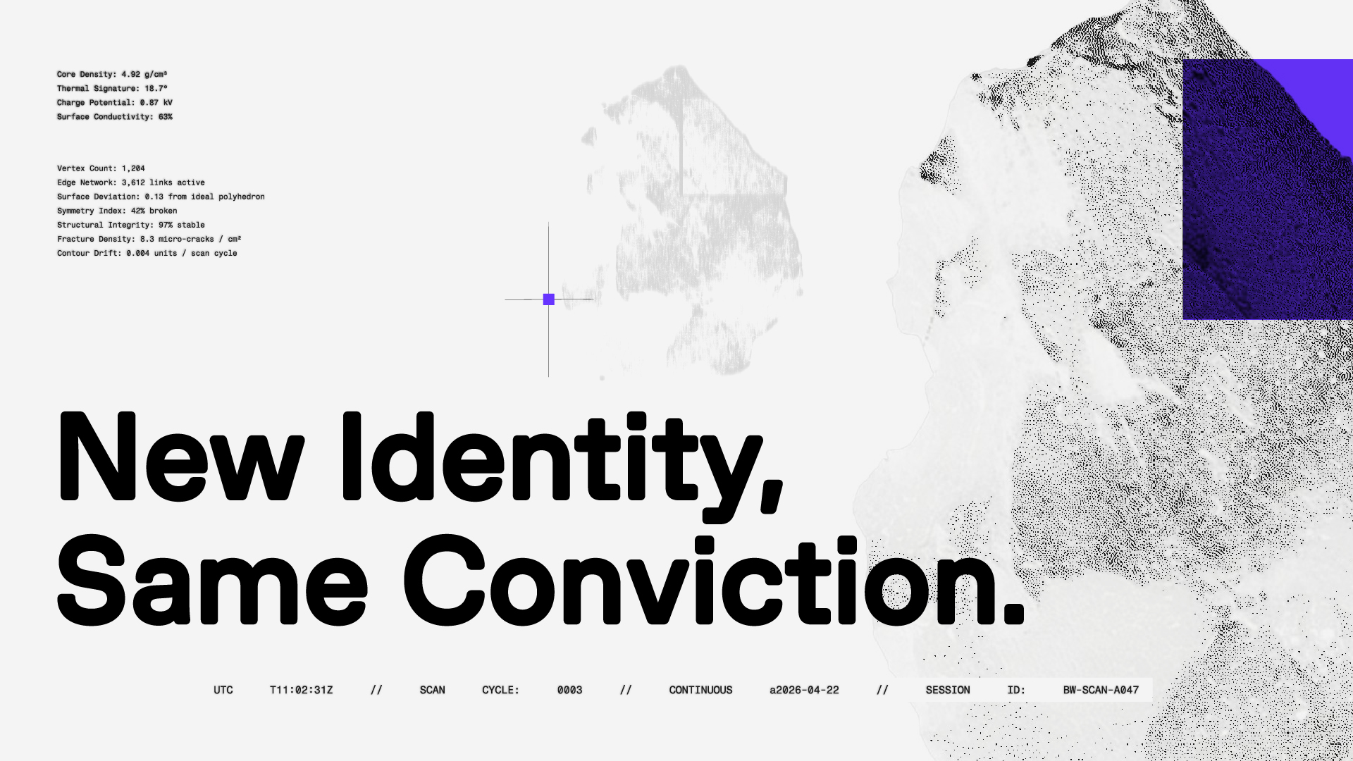
The onchain economy generates an enormous amount of data. Blocks, transactions, liquidations, flows, swaps, trades, unlocks, governance votes, bridge activity. Most of it is legible only to the people with the tools to read it, and even then, only in fragments.
Our job, across data and software, is to make that signal legible. Not to simplify it, but to interpret it. To give shape to things that are, by their nature, hard to see.
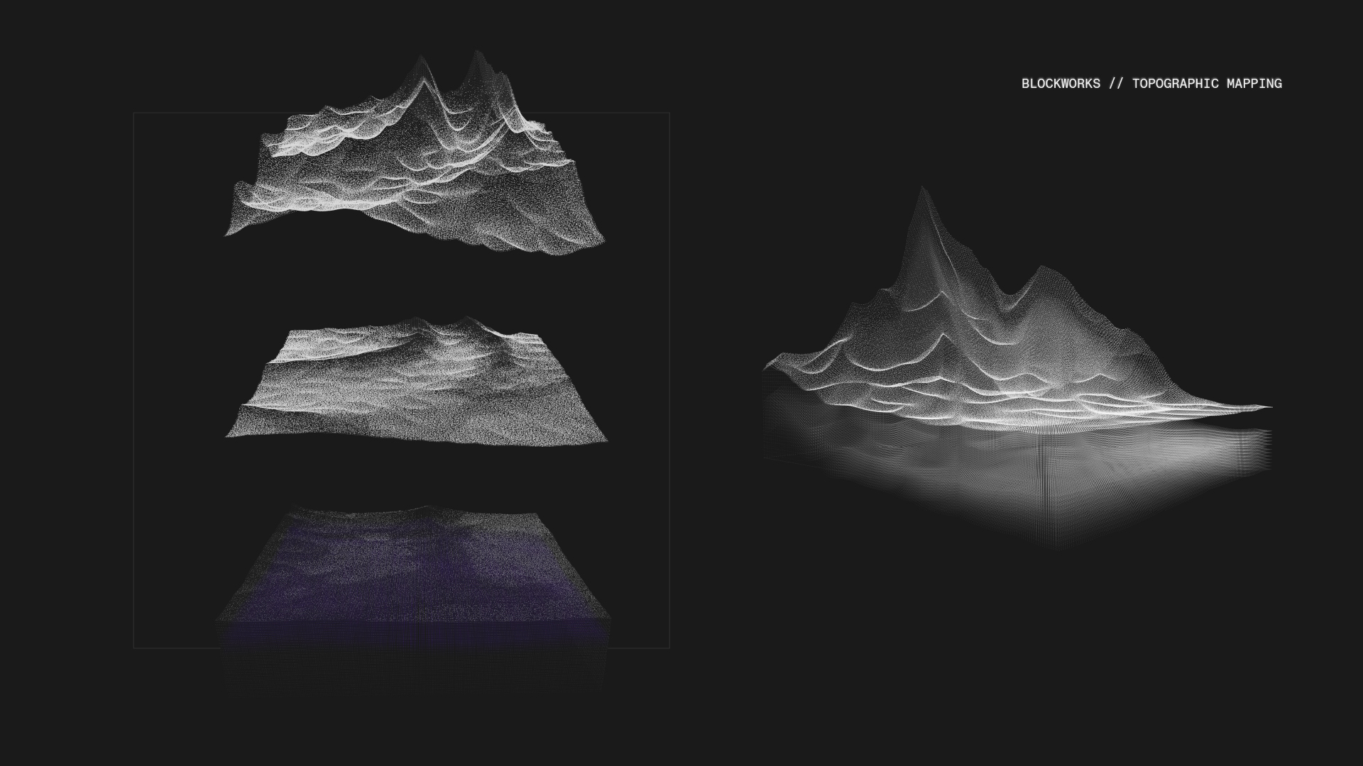
We began exploring how we might translate these themes into visual language to reflect the new Blockworks.
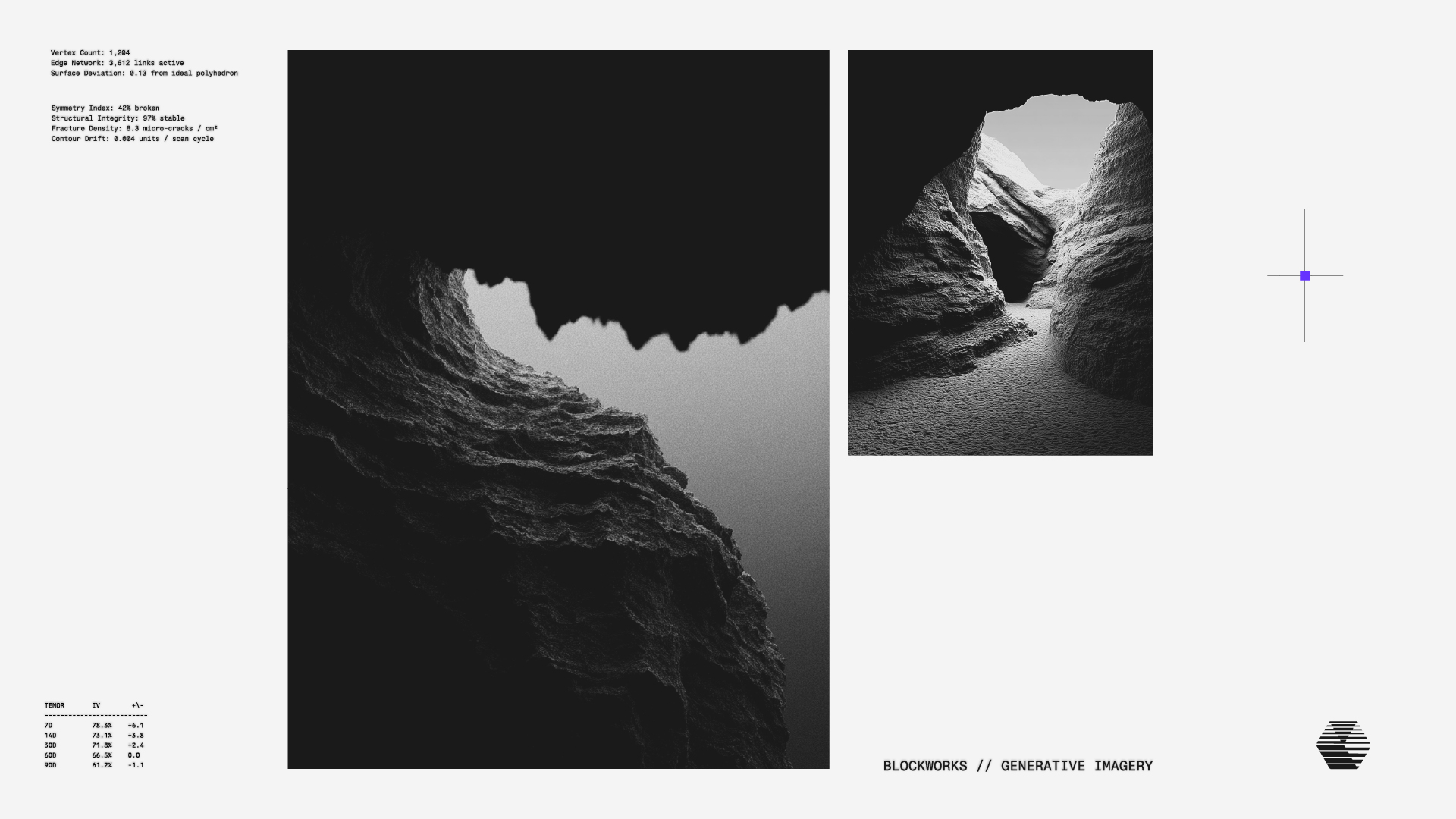
The "interpretation layer" became the phrase we kept coming back to. We were drawn to images of caves, rock formations, and geological layers.
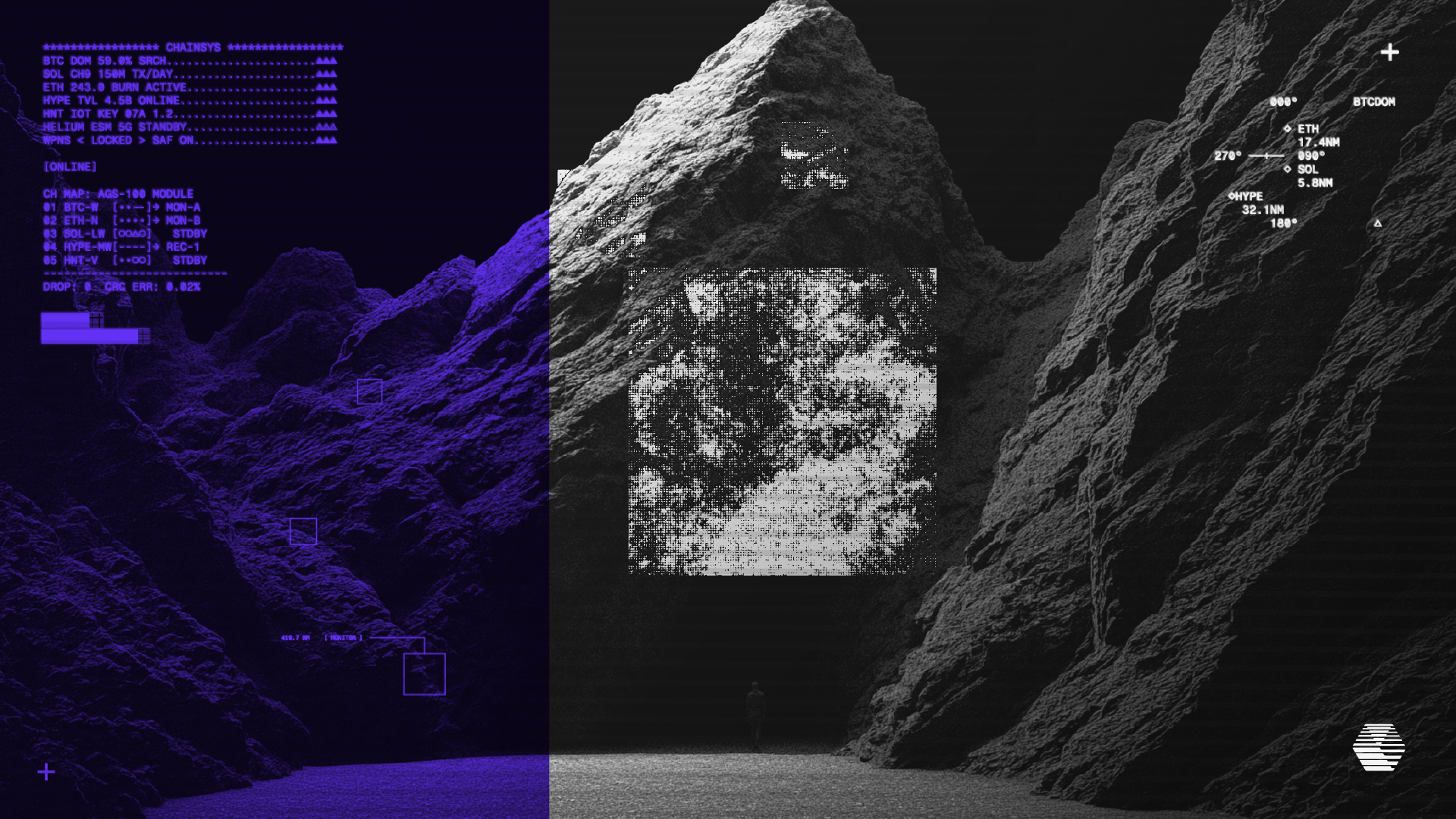
Then a breakthrough came from a different metaphor entirely: sonar. Sonar is what you use where light doesn't reach. You send out a signal, wait for it to come back, and you build a picture from what returns. Instead of illuminating the surface, it maps the depth.
This is the aesthetic vocabulary of things that are sensed before they're seen.
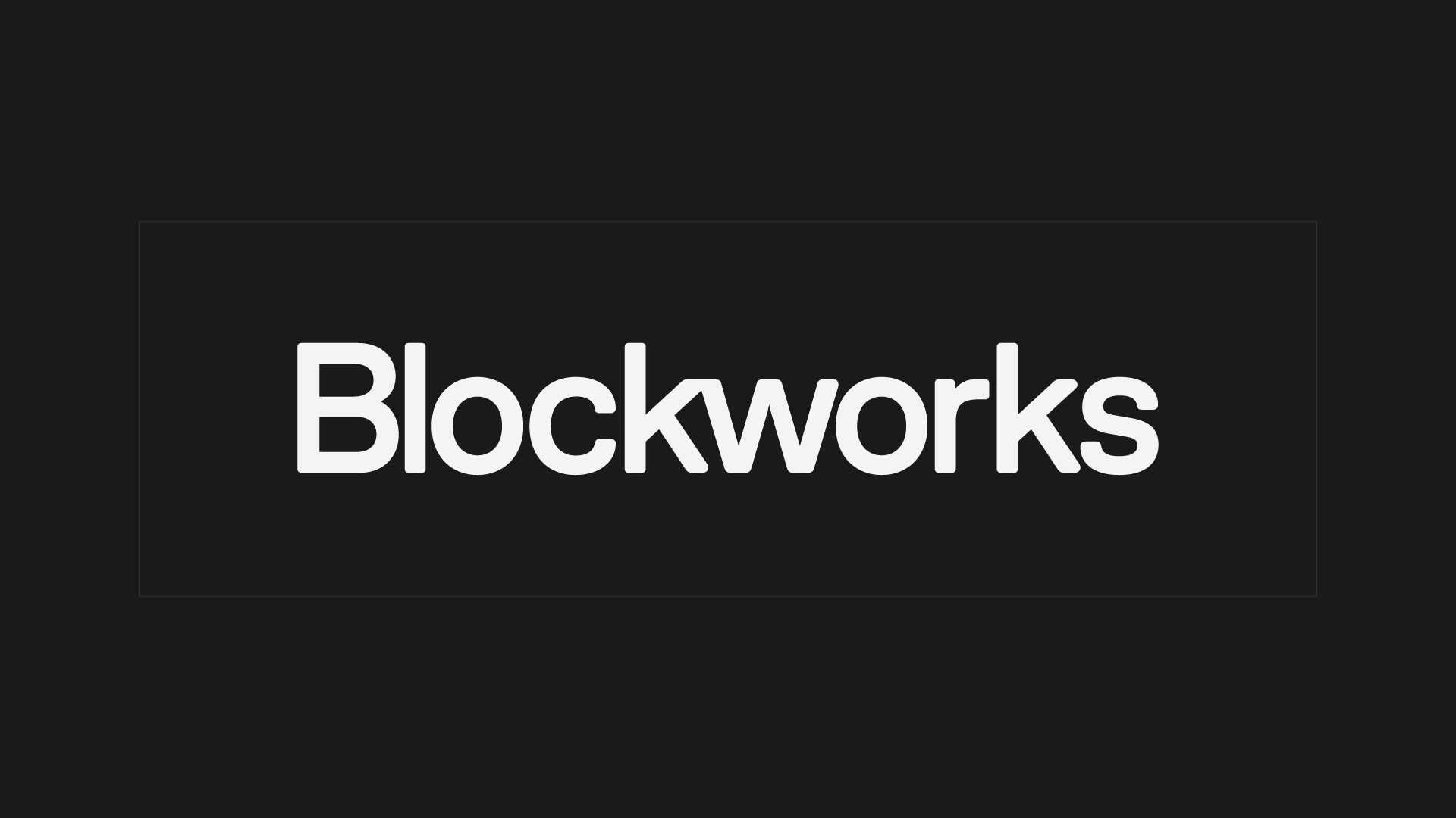
Introducing: the new Blockworks logo.
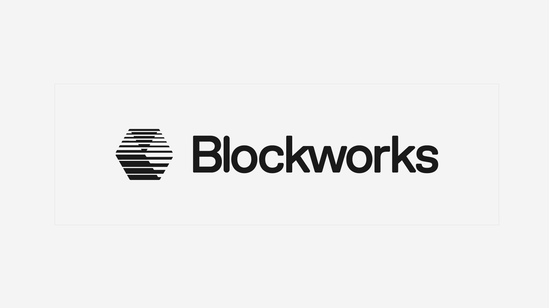
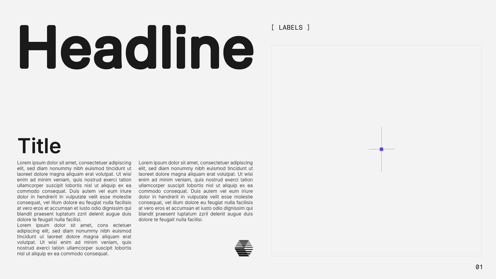
Our new symbol is constructed out of scan lines, stacking to create the optical illusion of a transparent isometric cube. The symbol represents our products and our promise, to deliver layers of insight and transparency to the industry.
We also refreshed our wordmark with a factory milled aesthetic, and rounded the corners for a lighter more sophisticated look.
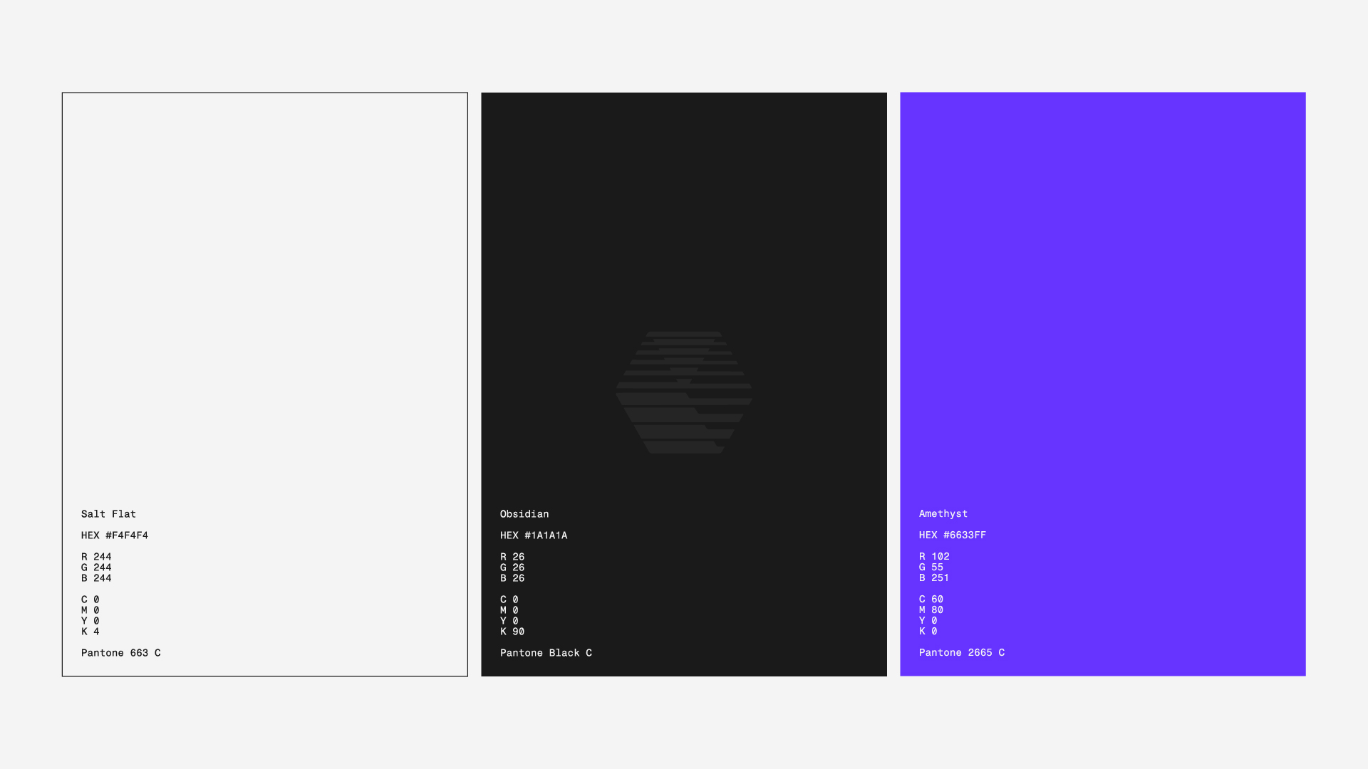
Our new color palette is built around contrast and signal. Three core colors, Obsidian, Salt Flat, and Amethyst, and from these anchors, a gradient system that extends the range.
Our type system incorporates three new typefaces. Milling is both bold and soft, with a technical edge. Inter represents clarity, legibility, and universal utility across platforms and contexts. Fragment Mono is a compact, technical, purpose-built font for the small type and data-dense environments where our brand lives closest to the product.
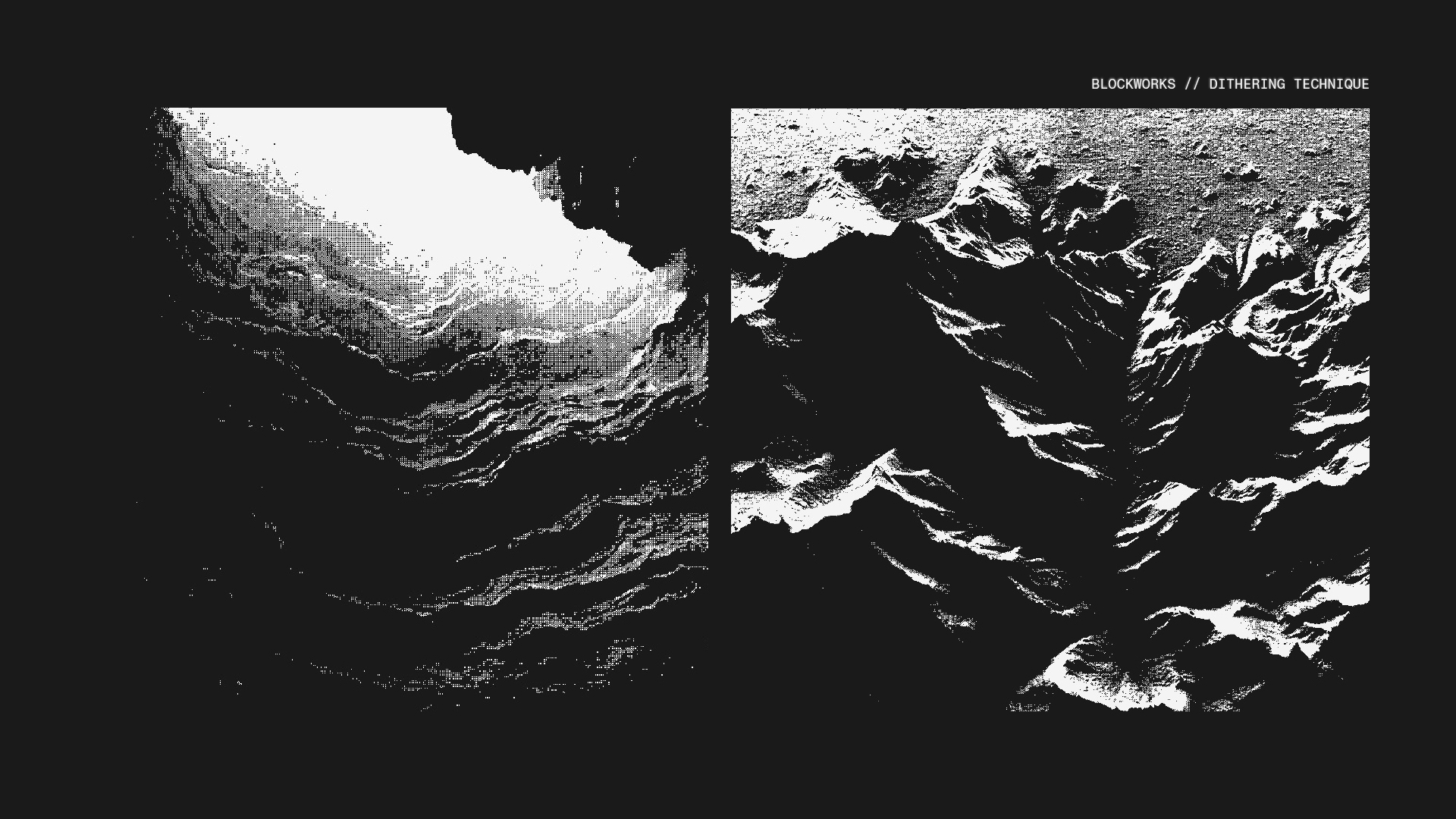
Before high-resolution displays, designers used dithering to render depth with limited tools, arranging pixels to suggest gradients and form. We use it the same way: as a texture that implies information density without resolving into noise.
Topographic contour maps are a direct expression of our brand story as layers of information. The maps carry an inherent sense of exploration, and the result is a motif that feels both analytical and adventurous.
Underneath it all is a specific vibe. High-contrast black and white photography of rock formations, a nod to cassette futurism, and the aesthetic of instruments that were built to read signals. Oscilloscopes, seismographs, early terminals. The visual world of people whose job is to interpret readings.
What comes next
The rebrand was months of collective effort to craft a cohesive vision that lives up to both our current reality and our aspirations.
A brand is more than aesthetics. It’s storytelling. It’s the sum of what we make, how we make it, and how it feels to use our products. Ultimately, a brand isn't what we say about ourselves; it's what others think of when they think of us.
This system is a foundation to build on, and a space in which to explore. Blockworks is creating something big. I couldn't be more proud of this new direction for the business, and I’m excited to continue developing and pushing the brand forward into the future.
Reid Hannaford
Director of Creative and Brand
Back to Insights
Newsletter
The Breakdown
Decoding crypto and the markets. Daily, with Byron Gilliam.
Blockworks Research
Unlock crypto's most powerful research platform.
Our research packs a punch and gives you actionable takeaways for each topic.
Blockworks Inc.
133 W 19th St., New York, NY 10011
Blockworks Network
Resources & Legal